Converting Trust into Contracts with CardSmart

Client
CardSmart.io
Role
UX Consultant
Project Timespan
March 2022–July 2022
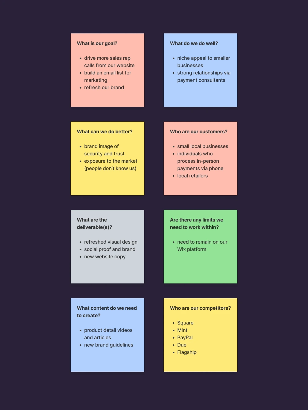
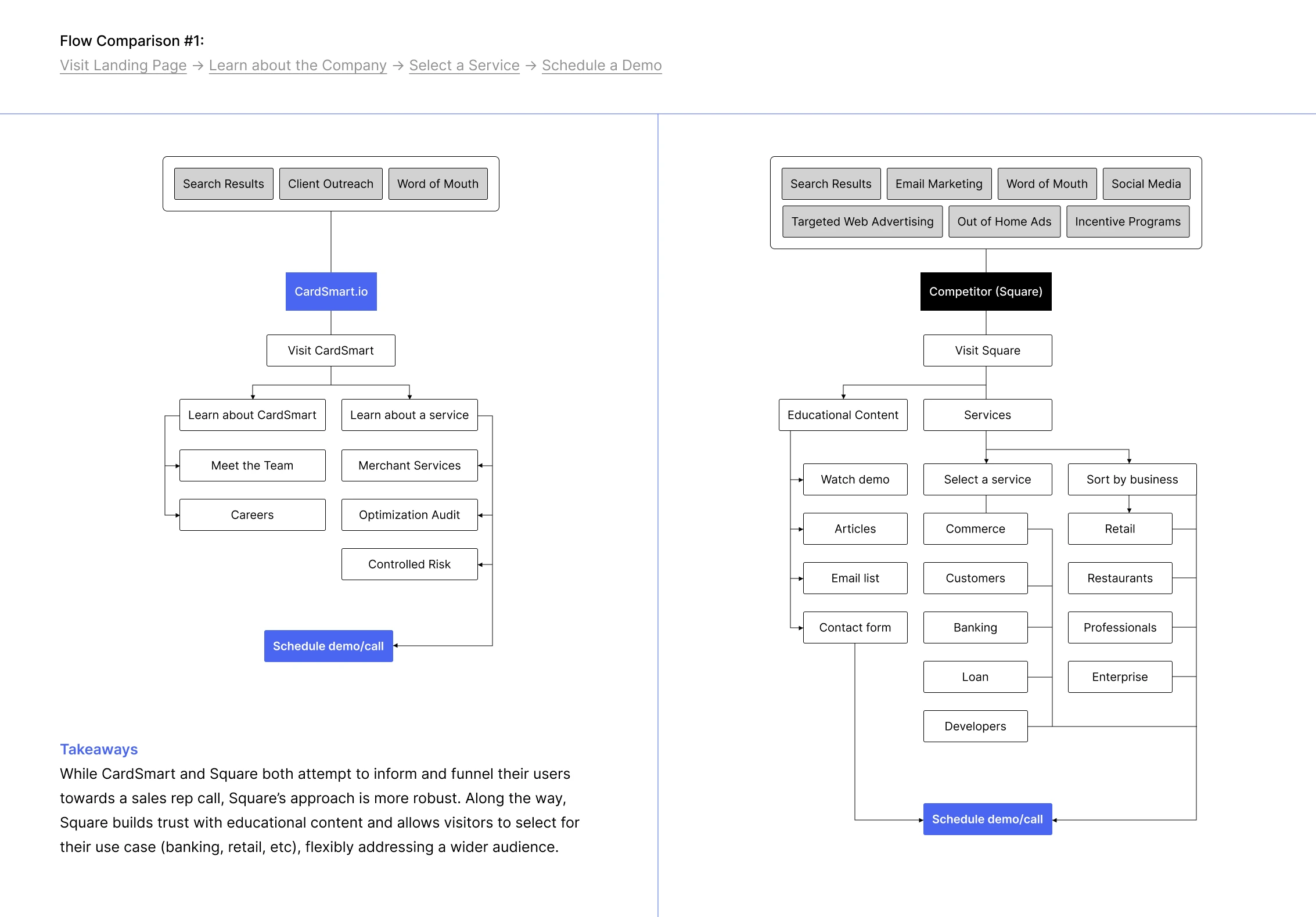
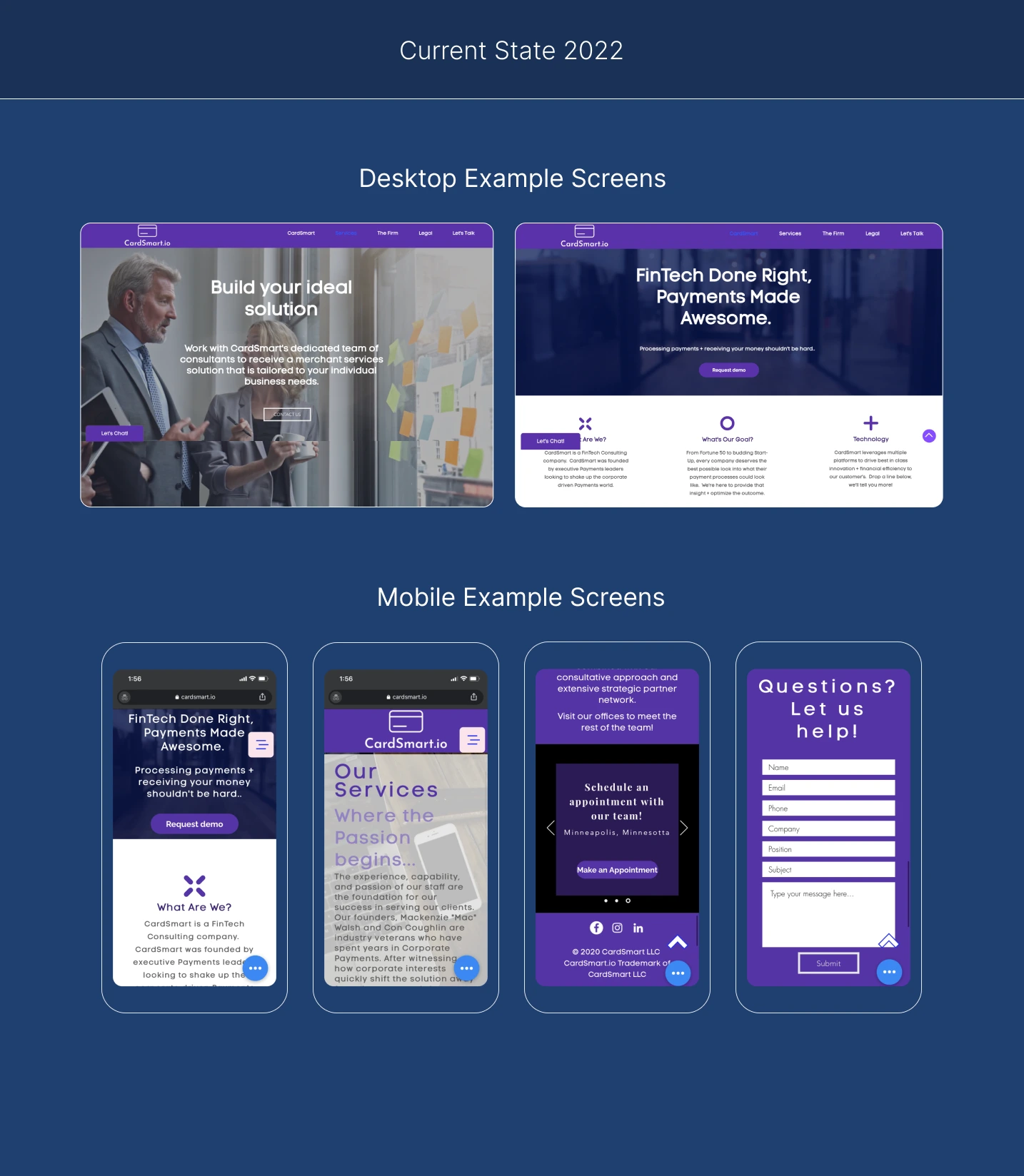
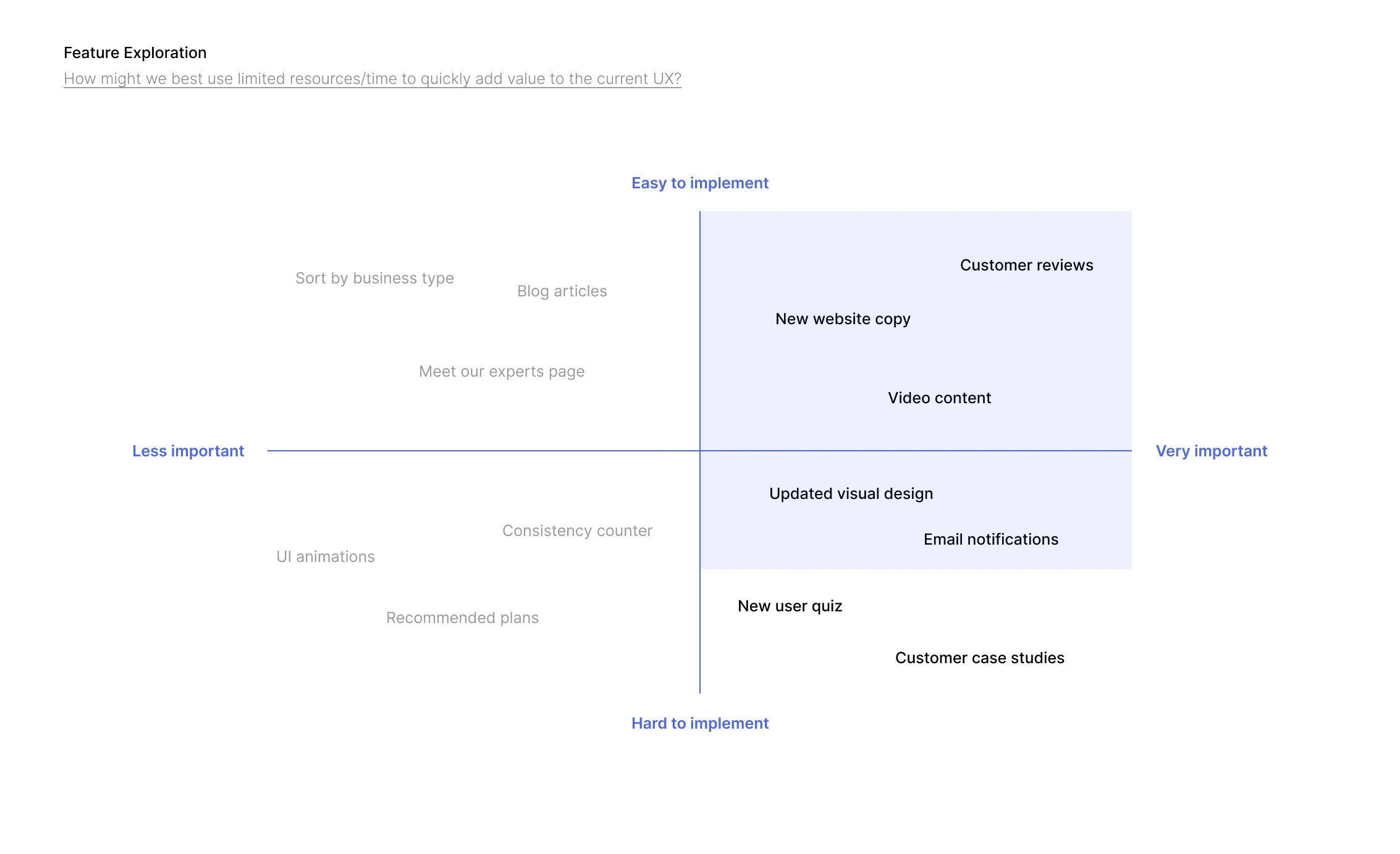
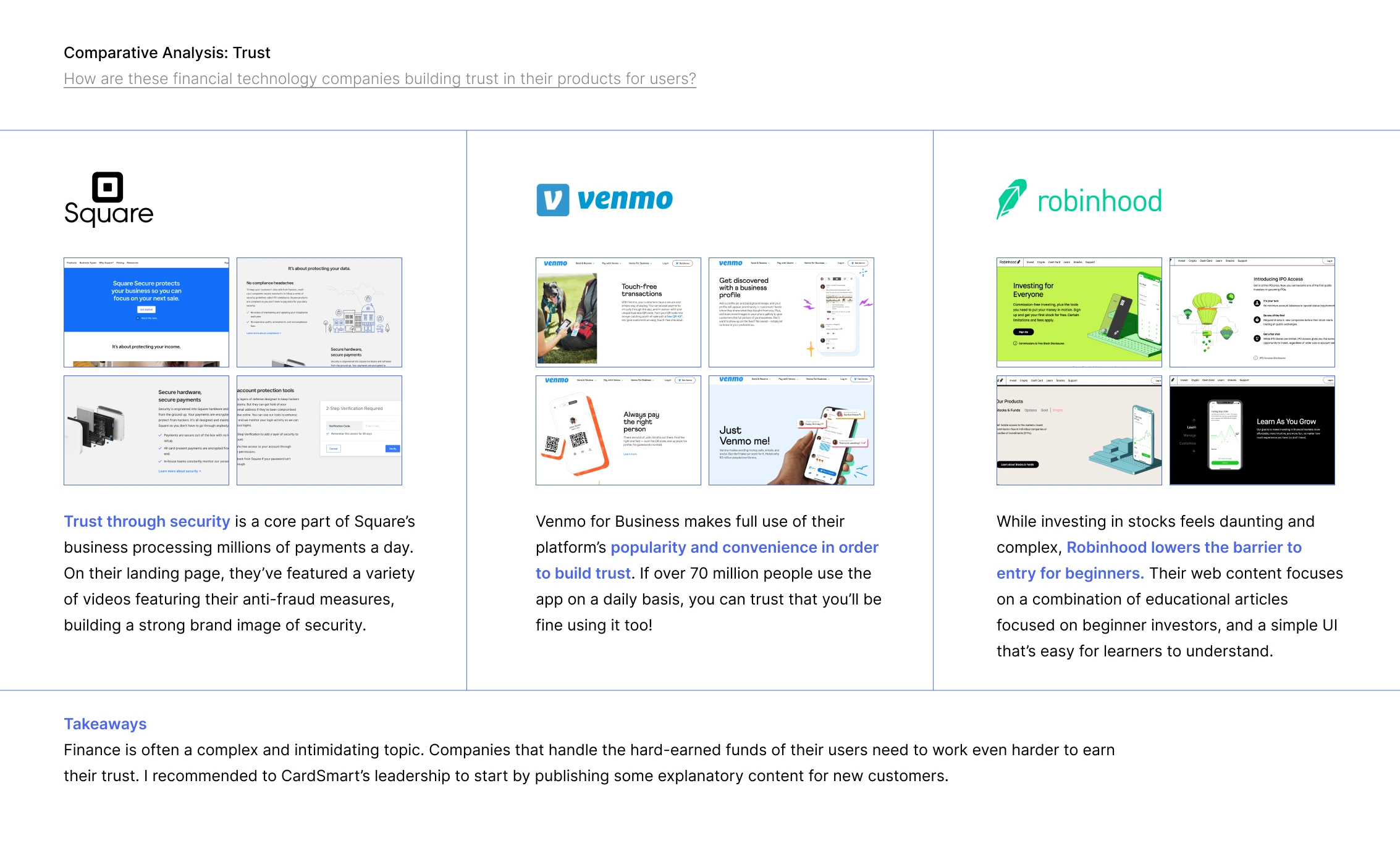
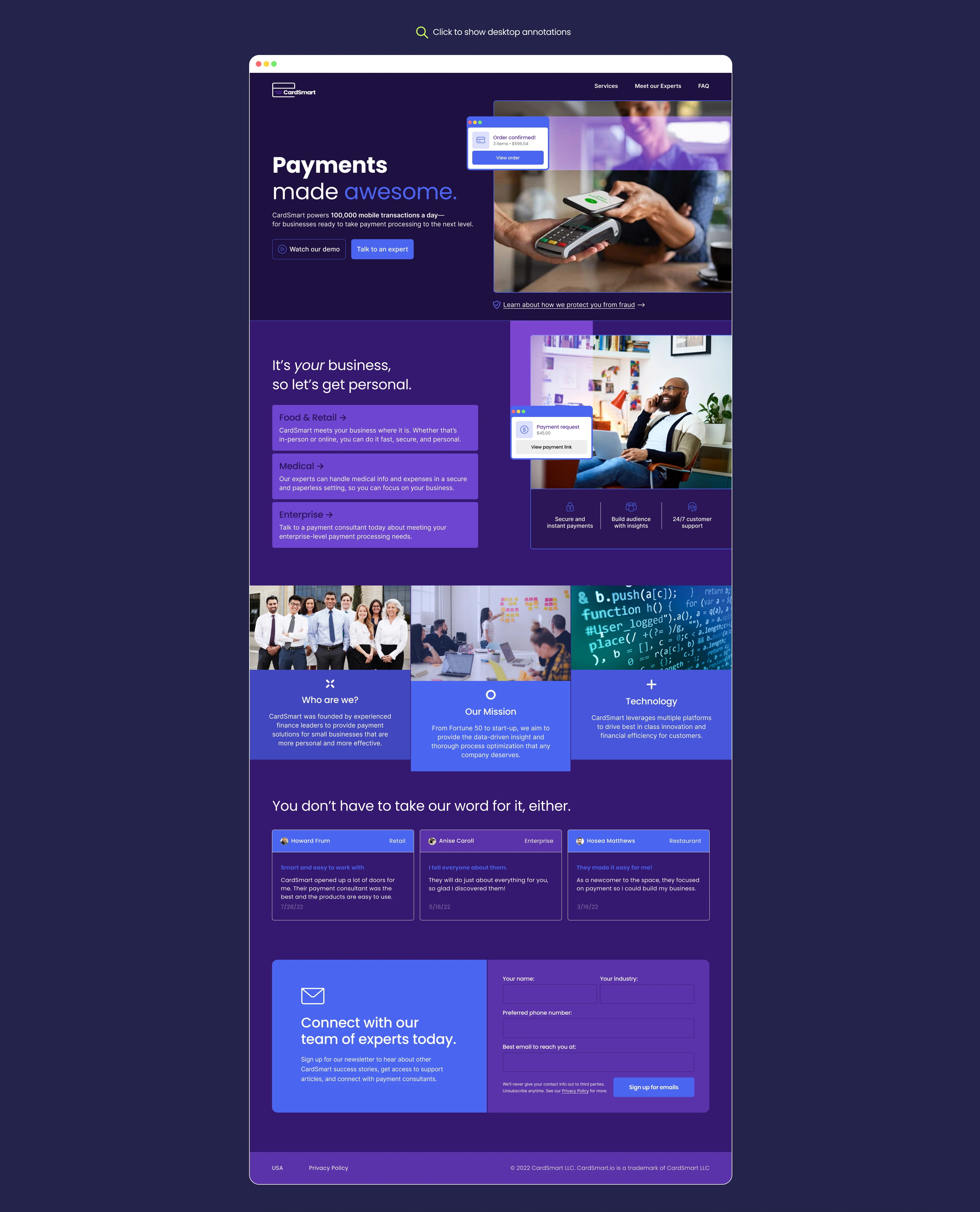
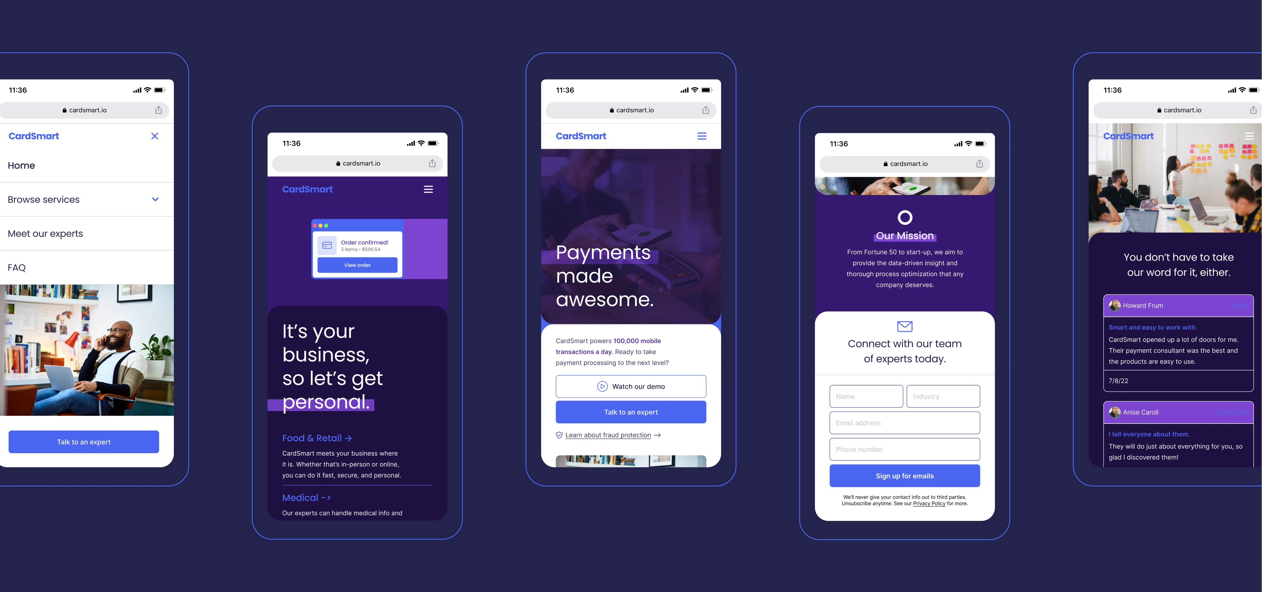
CardSmart is a financial technology startup that specializes in payment processing for small businesses—they handle over 100,000 mobile transactions a day!

I worked closely with their leadership team to refine their existing flagship site, converting page views into more software demos, ultimately leading to more contracts.

QUICK LINKS

DISCOVERY

In a discovery session with CardSmart’s account team, I learned that while they had no problem attracting potential customers to their website, they had difficulty converting those views into demo sessions for their platform.

I worked with them to find out why. I started with a full UX audit, followed up by some user feedback surveys.

UX AUDIT

I studied the current state of CardSmart's flagship site, navigating typical user paths from the landing page to booking a demonstration or phone call with a rep.

VISUAL DESIGN CRITIQUE

At a glance, CardSmart's landing page looked outdated. There were typos, legibility issues, and numerous areas where the typography could be improved—that is to say, it could use a professional touch.

Fortunately, redesigning the landing page meant every aspect of the site that could be improved was on the table. Discussions with shareholders and feedback from users guided this part of the process and helped me narrow down what was highest priority.

USER INTERVIEWS

I then worked with the account team to create and send feedback surveys to visitors who had visited the landing page, but didn't book a demo session or call.

1. Issues with clarity

"At a first glance, I wasn't sure what CardSmart’s services were."Max A

2. Lack of info

"I needed more info for me to choose CardSmart over their larger competitors, like Square."Megan L

3. Credibility

"Parts of the website look unprofessional, which reduces my confidence in the product."Catherine C

UX Solutions

Having identified the key bottlenecks and pain points in the user's journey, I defined 3 areas of the UX I wanted to improve.

1. SOCIAL PROOF

Build trust in the product by assuring secure transactions and a history of going the extra mile for small businesses

2. VISUAL REFRESH

Create a fresh visual design that communicates a simple but effective product to potential customers

3. SITE HIERARCHY

Reorganize the sitemap to give users all the info they need to make decisions and easily book calls with the account team

takeaways

Trust is a vital part of any business—especially for one that handles financial transactions! For smaller businesses like CardSmart that only get one first impression, their website is particularly important.

For me, this was an exercise in marrying the benefits of design with my clients' often abstract business goals, such as "building trust".

Home Next Project